


-topper.jpg)


.jpg)


Hello all.
The legend out in Blogoland known as Fuji has another question to ask so here it is.
What
is the ugliest card set you've ever seen?
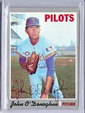
It's a pretty straight forward question but I bet the answers vary greatly. I will put my 2 cents in with the 1957 Topps set.

I am sure there are some out there that love this set for various reasons and that's all good but I am not one of them. Now as a collector there are many cards in this set that I would love to have, Mantle, Aaron, etc, but it's surly not for the card design. I don't think design is the best word since there is no design. Let's see, picture, a few words, done. Not much going on here. Even the colors used for the names doesn't make sense. Redlegs player = powder blue and white print?
That's just my opinion and this is what makes card collecting so much fun, the variety of each collector's tastes and opinions.

P.S. The Mets actually won today!
Thanks for Reading!


1 Comment:
These are definitely pretty bland... but I gave it a free pass, because it was so old ;-)
Post a Comment
Let Everyone Know What You Think